

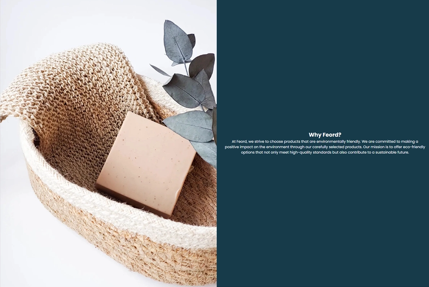
Feord
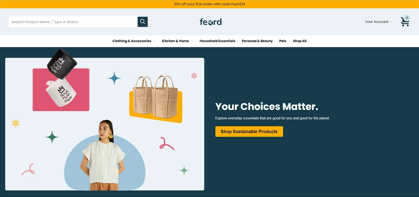
At Feord the personnel believe that small changes can make a big difference. That’s why they’re committed to providing eco-friendly alternatives to everyday products that are packed with harmful plastics and chemicals. Our mission is to make sustainable living accessible and convenient for everyone. By choosing our products, you’re not just making a choice for yourself, but for the planet. Join us in creating a healthier, greener future.
Our journey with https://feord.com/ has presented a series of exciting challenges and opportunities. We are committed to enhancing the website’s functionality and user experience. Here are some key challenges we’ve addressed:
1. Streamlined the checkout process by removing PayPal and Google Pay options, simplifying payments for users.
2. Redesigned cart interface, updated button colors, and improved navigation by removing unnecessary elements for a cleaner, more cohesive user experience.
Streamlining Navigation for Better Usability and Clarity
1. Improved clarity by renaming price sorting labels, simplifying the search page layout, and redesigning top search suggestions.
2. Enhanced user experience with clearer messaging for no search results and streamlined navigation by removing unnecessary buttons.
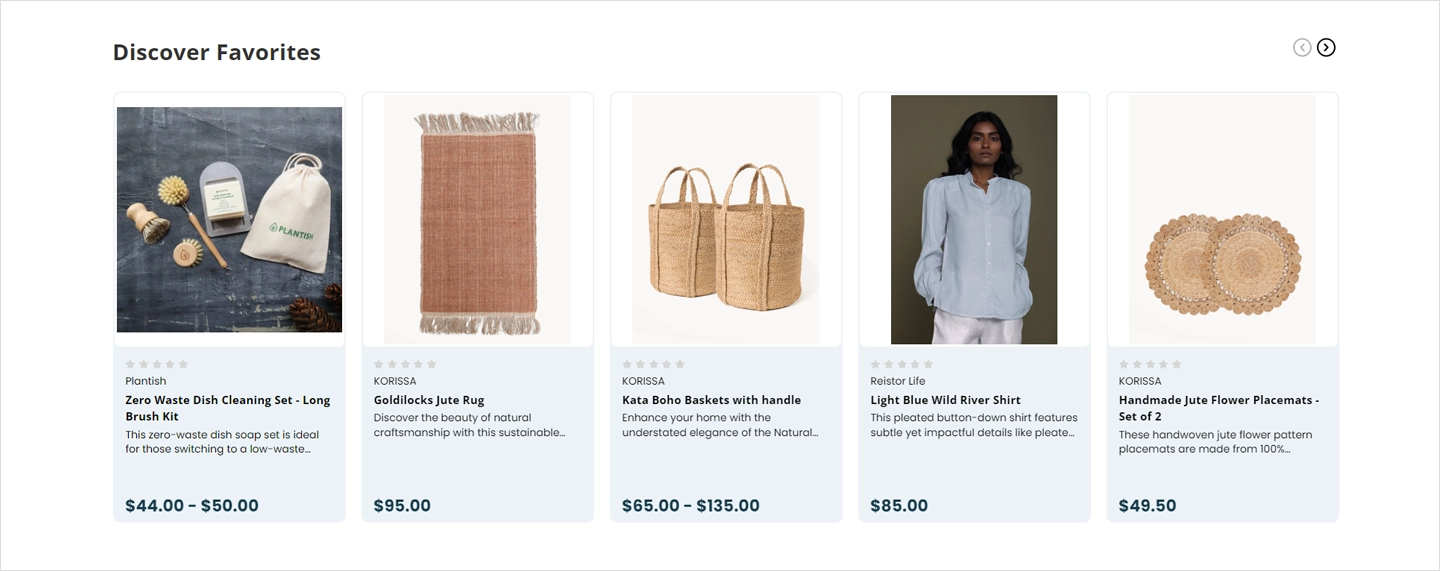
Product Page Improvements
1. Reduced white space and adjusted background colors for improved visibility and a more cohesive design.
2. Updated product card and quick view button colors to align with the overall design scheme for better visual appeal.
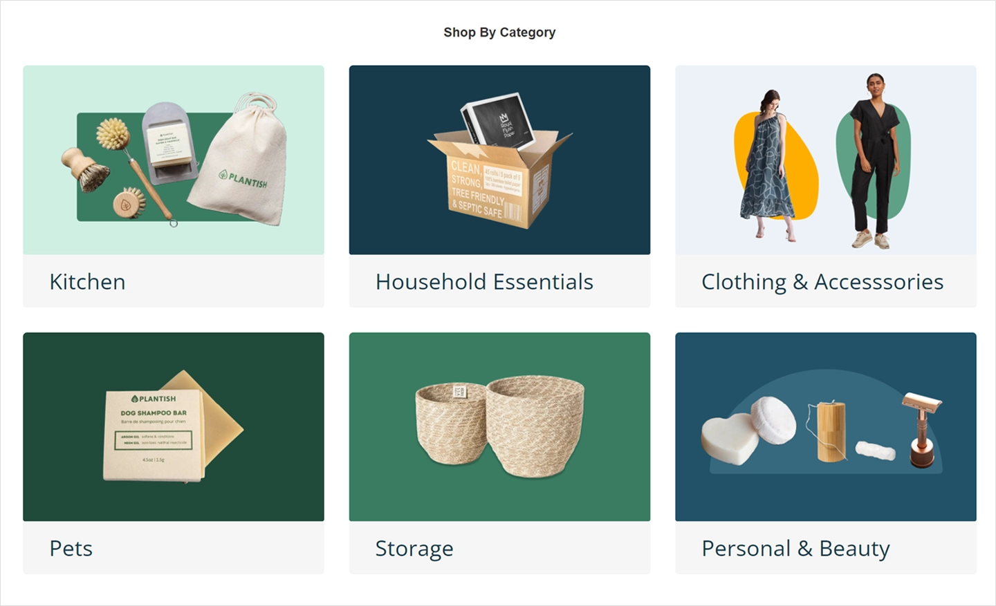
Home Page and Category Upgrades
Enhanced the “Shop By Category” section by adding a dynamic carousel for sub-categories and restructuring the content display for improved organization and visual appeal.
Refined branding elements by implementing a static SVG logo, updating “page-sidebar” colors for visual consistency, and creating a custom sidebar-less category template for a cleaner, streamlined look.